Project
This is a magazine cover concept for a men’s lifestyle/culture publication. I focused on visual hierarchy, type pairing, and strong imagery to guide the reader’s eye.
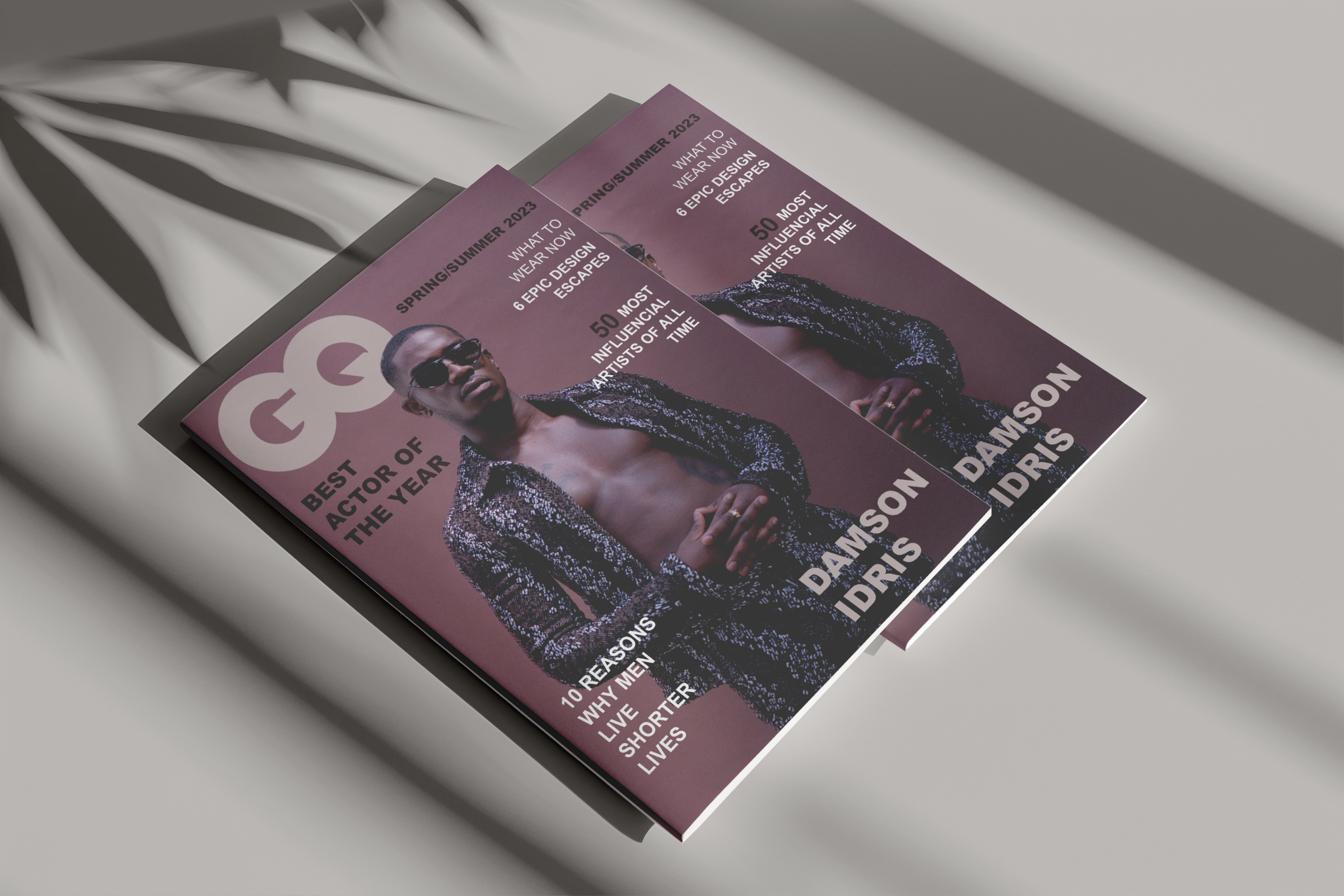
Challenge
The cover needed to balance multiple headlines and cover lines without feeling cluttered, while still giving the main story clear priority.
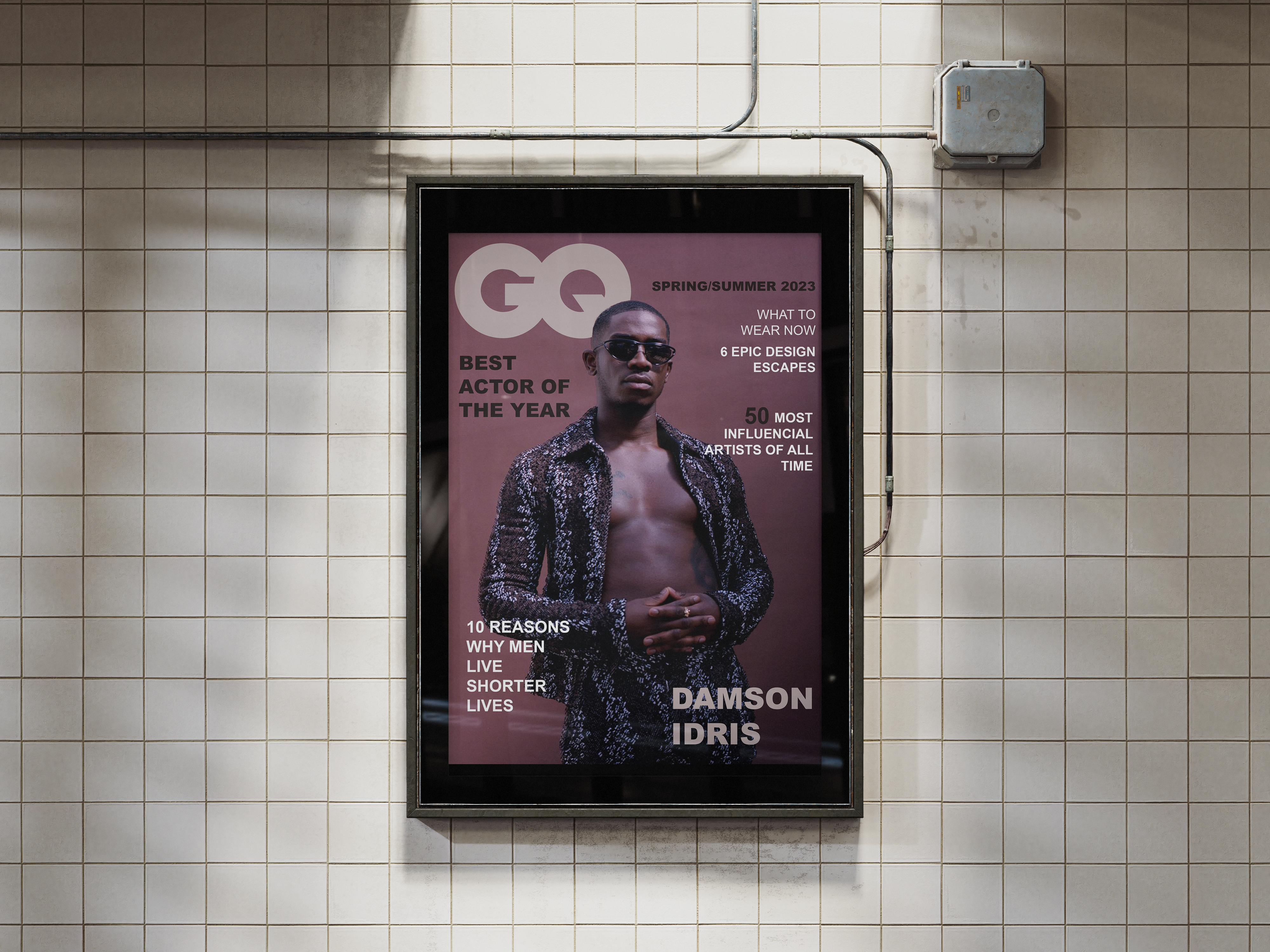
Solution
I built the cover on a strict grid, using size, weight, and color of type to create hierarchy. The main image is framed with negative space, and the masthead interacts with the photo, giving it a professional editorial look.